The choice of colors in architecture is a fundamental step in any architectural project. It’s because they have the power to provoke sensations — from enthusiasm to calm — and completely transforms the way we perceive environments. However, although there are trends that guide the market, the interpretation of this visual element is subjective, which prevents the application of universal rules or ready-made formulas to definitively guide sensory stimulation.
It is with this in mind that Casoca has prepared an article on the use of colors in architecture and what is behind this process. And to further enrich this discussion, we received Fernanda Maceri, Head of Strategic Marketing at DEXCOto discuss in the Outlook table.
In the conversation, available on our YouTube channel, Fernanda explains how the study of color can help create more meaningful projects and promote a greater sense of belonging for those who use the spaces. Check it out
What is the importance of colors in architecture?
Well beyond the aesthetic domain, colors are tools for creating sensory experiences and can influence our emotions and perceptions in a given space. Additionally, when applied strategically, they can change our perception of the size and functionality, brightness, and even thermal feel of environments.
“Color is a visual stimulus caused by light and interpreted by our brain. It is the first element that we perceive as a visual stimulus and its characteristic is to awaken emotions in us,” explains Maceri, color specialist and USP doctor.
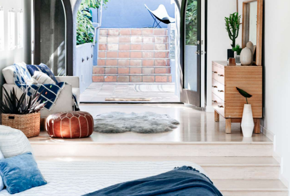
This is why architects and interior designers use colors to create environments that meet the goals of the space and the needs of the target audience, functioning as a kind of extension of visual language of this architectural project. So, for example, it is possible to enlarge or brighten a space by using light tones, such as white and beige, or to make it more intimate with dark colors, such as black and navy blue.
How do colors influence the perception of environments?
It is undeniable that the way we perceive and interact with the environments around us can be influenced by the choice of colors during a project. After all, they influence our sensation of temperature, lighting and even our emotional state when we are in a certain space. It is therefore important to consider that chromatic choices are allies in creating sensory experiences unique, giving more meaning and belonging to those who occupy this environment.
Here are some important points to consider when choosing a color palette:
- Perception of space: Light colors have the power to visually expand environments, creating a feeling of openness and brightness, while dark tones provide more intimacy and sophistication.
- Thermal sensation and lighting: Warm tones warm spaces, while cool tones can create a feeling of freshness. Likewise, light color palettes reflect and increase brightness, while dark palettes create introspective atmospheres with less light intensity.
- Emotional and psychological impact: Bright colors like yellow, for example, stimulate joy and creativity, while blue can bring calm and relaxation, and red creates a sense of urgency, even passion. However, this application is not a rule and depends on different contexts, requiring further study for better understanding before its use. For example, the color blue may bring a sense of calm and serenity to one person, while for another it may lead to melancholy or specific memories, demonstrating how our perception is subjective and influenced by individual experiences.
What should you consider when thinking about colors in architecture?
Making a good choice of colors in architecture and design projects is a process that goes beyond aesthetic composition and must take into account several factors related to the environment and its surroundings. A good example is to think about how the orientation of the sun can affect our perception of a certain color. THE interaction with natural and artificial lightfor example, helps to enhance color effects, creating specific atmospheres when considering the hue, brightness and saturation effects of this color palette.
Another important point is the materiality and textures chosen which can help highlight or soften a color. Natural elements such as wood and stone are great choices to accompany earthy tones, while metallic or shiny finishes reinforce more modern, even futuristic palettes.
However, it is essential understand the cultural context your target audience lives in or has been exposed to throughout their lives. Colors have different meanings in each country and must be applied in architectural projects based on study and active listening to the potential client.
The importance of methodology behind color trends
Color trends are important tools in architecture and design because they help professionals in these fields and others think about projects aligned with the sociocultural and aesthetic expectations of each time of year. However, to be effective, these trends must be based on the methodology and lots of studies.
“I believe that today companies [que fazem estudos de cor] They are increasingly seeking help from researchers to uncover this trend with more information. Above all, they seek to understand human behavior in order to carry out conscious and coherent work,” explains Fernanda Moceri, color specialist.
One of the most famous examples is Pantone’s announcement of the color of the year, always in early December. The action gained popularity in the 2000s with the proclamation of Azureas the first color of the millennium. Since then, more than 20 colors have been chosen by a team of 40 global experts who are part of the Pantone Color Institute and, over the course of the year, they analyze color trends in areas such as cinema, fashion, art, lifestyle and technology, in addition to of course socio-cultural changes on the planet.
Latest Posts Published

10 reasons to buy an LED desk lamp
Cosmina Ruxandra Chinciu: The joy of the client when he sees that in reality
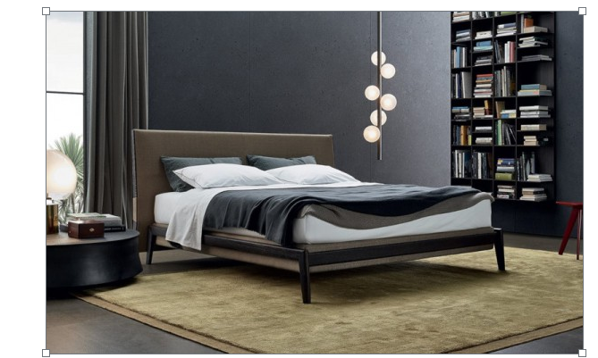
Luxury bedrooms – Poliform product
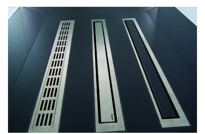
Shower with gutter – solution for continuous floors in bathroom desig
Studio layout – creative configuration solutions
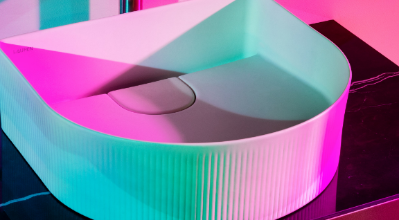
Reinventing the bathroom: Laufen’s Sonar collection sets new standards

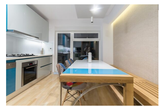
The kitchen. The heart of the house
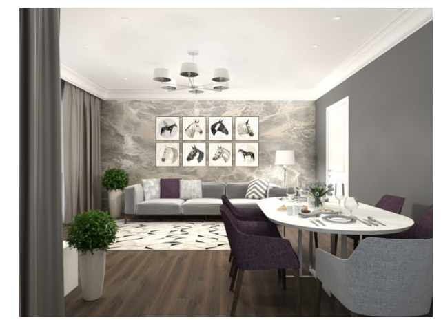
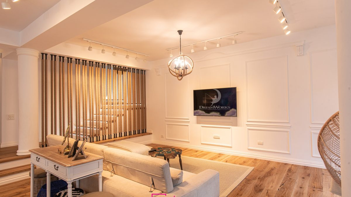
Living room interior design – Design styles

5 bathroom design ideas from Villeroy & Boch